According to the dictionary a graph is a diagram that represents the
variation of a variable in comparison with that of one or more other variables.
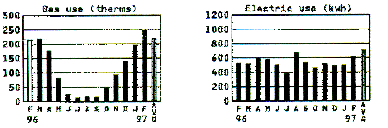
We are exposed to graphs almost daily. Figure 1 shows two graphs that appeared
on my monthly utility bill, showing the amount of gas and electricity I
used each month between February 1996 and February 1997.
Figure 1. Gas and electric usage between February 1996
and February 1997.
These graphs allow me to draw several conclusions:
In general, a graphical representation of data makes it easier to observe
trends. Graphs not only allow us to look for trends in the past, but also
allow us to make predictions for future trends:
Of course some of these trends are expected:
Other trends are not necessarily expected:
Figure 2 shows several graphs that appeared on March 27, 1997, in the
Business Section of the New York Times and show trends in the Standard&Poor's
500-stock index, in various Interest Rates, and in the values of the dollar
against the yen. The time period covered by these graphs is 6 months, from
October 1996 until March 1997. The first graph shows the value of the Standard&Poor's
500-stock index over this preriod. The bold line shows the value pf the
stock index at the end of each week and shows significant variations on
a week-to-week basis. The solid "bottom" line shows the average
value of the stock index over the preceding 150-day period (a so-called
running average). It shows significantly less week-to-week variations since
it is based on a long-term average (and a significant variation for a given
week will have a much smaller effect on the average overthe preceding 23
weeks). The running average is a much better indicator and predictor for
long-term trends in the stock index.
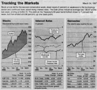
Figure 2. Tracking the stock market.
Physical concepts and the relationships between them can be represented
in many ways. The most commonly used technique is the graphical representation.
We will limit ourselves to two-dimensional graphs. Each point on a two-dimensional
graph represents a pair of numbers. These two numbers are repreented by
the location of a point with respect to two perpendicaulr lines called axes.
On the graph shown in Figure 3, the vertical axis has a scale to represent
mass, and the horizontal axis has a scale to represent volume. The single
point shown in the graph in Figures 3 represents the mass and volume of
a particular piece of aluminum with a mass of 5.4 g and a colume of 2.0
cm3. In the language of graphs, the number 2.0 is called the
horizontal coordinate, or abscissa, and the number 5.4 is
called the vertical coordinate, or ordinate.
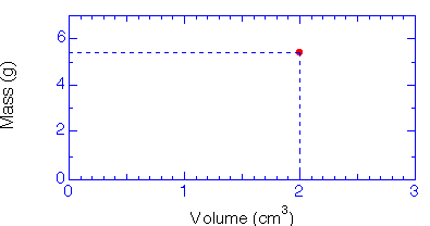
Figure 3. Mass versus Volume graph.
Each point on a graph has two coordinates. Below you see two coordinate axes, labelled x(m) and y(m), that can be used to make a graph of the motion of a soccer player on a soccer field. A given position is uniquely defined by the projections of its location on the x and y axes. Use the mouse to click on this soccer field and the coordinates of that location will be shown next to the soccer field.
There are different ways to display motion. The motion of a soccer player on a soccer field can be displayed by plotting his/her position at various times on a two-dimensional "position" graph. This position can be uniquely defined by specifying two position coordinates (x, y). Use the mourse to indicate the position of the soccer player on the soccer field at different times. Your will see the trajectory of the motion emerge.
Instead of looking at a trajectory graph we can also describe the time dependence of the two position coordinates. The two smaller graphs on the right-hand side show the time dependence of the x and y cooridnates. These graphs are automatically updated when you plot the trajectory of the soccer player. Note that the shape of the graphs of the x and y coordinates as function of time are very different from the shape of the actual trajectory.
© Frank L. H. Wolfs, University of Rochester, Rochester, NY 14627, USA
Last updated on Monday, January 22, 2001 9:09