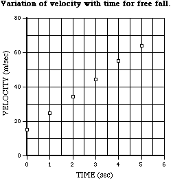
Experimental work in science frequently involves studying the relationship between two interacting variables. One example would be how the velocity of a falling body varies with time. In such an experiment, the dependent variable (velocity in the above example) is measured at a series of values of the independent variable (time in the example). Data from such an experiment might be recorded as in the tabular form below.
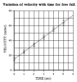
Velocity in Free Fall
|
|
| t
(sec)
|
v
(m/sec)
|
| 0
|
15.0
+/- 2.3
|
| 1
|
24.8
+/- 2.2
|
| 2
|
34.1
+/- 2.1
|
| 3
|
44.4
+/- 2.5
|
| 4
|
55.0
+/- 2.9
|
| 5
|
64.0
+/- 3.2
|
Table 1
Numbers in a table like this do not convey the relationship (or lack thereof) between the variables to the human mind very easily. This can be done with more immediacy by drawing a graph.
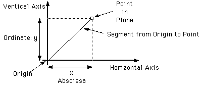
A (2-dimensional) graph is a picture in which a relationship between two variables is expressed as a line drawn in a plane.
Any point in a plane can be located by reference to two perpendicular rays, called axes, given in that plane. Consider the segment from the intersection of the axes (called the origin) to the point in question. By
In this way a point relates two numbers, its coordinates. And thus a line in the plane determines a relationship between two variables; namely the relationship between the abscissa and ordinate of all points on the line.
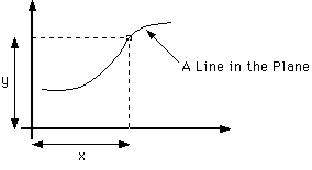
If a smooth curve is drawn through such a plot of points it may give some idea of the curve that expresses the functional relationship between the variables. The more points, of course, the more detail and confidence there will be. In this way, intermediate values (which have not actually been measured) may be estimated by interpolating between the measured points with a smooth curve. Also, drawing graphs like this is a useful way to learn about and estimate the functional form of a relationship between measured variables.
In the case of the example, it can be seen (on next page) that a straight line fits rather well, with the plotted points deviating only slightly from it. The equation of such a straight line is
![]()
for some constants
![]() and a. These constants can be read right off the graph. The intercept (where
the graph intercepts the y-axis), 15m/s, is
and a. These constants can be read right off the graph. The intercept (where
the graph intercepts the y-axis), 15m/s, is
![]() and the slope, about 10m/s2, is a. In this way an algebraic
expression estimating the relationship between the variables in the table can
be obtained.
and the slope, about 10m/s2, is a. In this way an algebraic
expression estimating the relationship between the variables in the table can
be obtained.
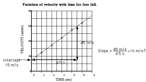
Any plot of experimental data must include an indication of the uncertainty. Errors are indicated on a plot by error bars above and below the plotted point which show the range of possible values.
The example has been replotted, above, to include error bars. Note that when the bars are included it is apparent that the line drawn through the points could be just as well be moved up or down or changed in slope a bit and still pass inside the error bars. This is an indication of the uncertainty of the line drawn through the points. In this way, the uncertainty in the parameters of the straight line fit obtained above (intercept and slope) could be estimated.
Sometimes the relationship between data variables may not be linear but by a simple transformation can be converted to a linear form. For instance, if the pressure of a sample of gas were measured as a function of volume it should obey,
![]()
the Ideal Gas Law. If this were plotted it would yield the hyperbola of Boyle's Law but it would not be readily apparent to the eye how accurately the plotted curve did so. However,
![]()
is a linear relationship. If P is plotted against the reciprocal of V it should yield a verifiable straight line. A test of the law would be that the intercept should be zero. And a value for NRT could be gotten from the slope.
![]()
![]() (4)
(4)
then taking logarithms (log denotes the logarithm to the base 10) of these equations yields,
![]()
![]() ,
(5)
,
(5)
linear relationships which can be treated as before.
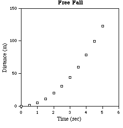
Free Fall Distance vs. Time
|
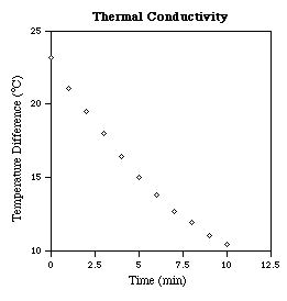
Thermal
Conductivity
|
|||
| time
(sec)
|
distance
(m)
|
time
(min)
|
DT
(deg.C)
| |
| 0.0
|
0.00
|
0
|
23.2
| |
| 0.5
|
1.29
|
1
|
21.1
| |
| 1.0
|
4.9
|
2
|
19.5
| |
| 1.5
|
11.0
|
3
|
18.0
| |
| 2.0
|
19.6
|
4
|
16.4
| |
| 2.5
|
30.6
|
5
|
15.0
| |
| 3.0
|
44.0
|
6
|
13.8
| |
| 3.5
|
60.0
|
7
|
12.7
| |
| 4.0
|
78.4
|
8
|
11.9
| |
| 4.5
|
99.2
|
9
|
11.0
| |
| 5.0
|
122.5
|
10
|
10.4
|
Table 2
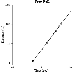
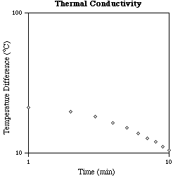
To illustrate these logarithmic techniques, consider the following sets of data. The first table is for free fall and the second table is for cooling due to thermal conductivity. If rectangular plots are made of these data the results clearly fall near reasonably smooth curves but the nature of these curves is not apparent by inspection. Use of logarithmic plots is much more informative.
![]()
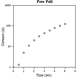
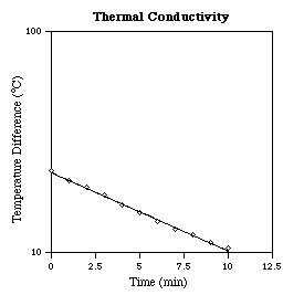
Observe that in one decade on the x-axis (say from 1 to 10) the line rises about two decades on the y-axis; so the slope is about two, representing a quadratic power law. Also for x = 1 the y value is 4.9, the proportionality constant. Thus, examination of the graph determines the relation between the variables to be
![]()
where g = 9.8 (the magnitude of the acceleration due to gravity in the units used).
Making a semi-log or a log-log plot is particularly useful in determining if, and the extent to which, the variables in a set of data are related exponentially or as a power. And the functional parameters of such relationships can be estimated from the graphs.
There are other types of plots that are convenient when dealing with certain types of data.
For instance, when the independent variable is an angle it would be appropriate to plot the dependent variable versus an actual angle on a polar plot. An example of this would be the angular distribution of radiant intensity transmitted through a small aperture. Special polar graph paper is available for such purposes.
In addition, it may be useful to use axes with logarithmic scales even if producing a straight line (as in those cases considered above) is not an object. For instance, if a wide range values of a variable (several factors of ten) needs to be plotted this allows the small values to be displayed legibly rather than squashed up together near zero. Some physical phenomena (like the sensation of intensity in the human ear) are logarithmic in nature and so most naturally displayed with a logarithmic scale. Logarithmic scales also facilitate identifying features related by ratios since equal distances on a logarithmic scale represent the same factor.
Drawing a smooth curve or a straight line on a graph is a useful but rather subjective procedure. These kinds of estimates can be made in a more precise and systematic way by what is called the method of least squares.
Only the case investigating the extent of a linear dependence between y and x will be considered here. That is, a function of the form
![]()
which fits a set of data will be sought. (This same sort of process may be used, as above, for exponential and power law behavior by taking logarithms.) The problem consists of finding the slope m and intercept c,
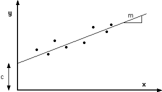
![]()
the object is to obtain the "best" fit so that,
![]()
as closely as possible.
To do this the idea is to form some measure of how closely a line fits the data and find the values of the slope and intercept which optimize this measure. The sum of the squares of the deviations,
![]()
is a quantity which increases the further any of the data points lie from the line and gives more weight to points farther from the line. There is nothing profound or magic about the use of this quantity; it is merely a plausible, but ad hoc, measure of the fit. The line whose values of m and c minimize the above quantity is a plausible one to use as a best fit. This is the method of least squares.
The quantity S(M, c) will be a minimum when both partial derivatives vanish,
![]() and
and
![]() (10)
(10)
These two equations can be rewritten as a pair of linear equations for the parameters of the fit, m and c,
![]()
![]() .
(11)
.
(11)
Thus, the best straight line goes through the point
![]() where
where
![]()
In terms of these quantities we can solve for the parameters of the fit,
![]()
There are many pocket calculators which can calculate the necessary sums automatically. And there are many computer programs available with facilities for doing least squares fitting.